What is the Font Psychology?
It is very real when someone asks you to wait till he reads something and you ask him what caught his attention to read it! Well, yes, fonts have different impacts on. We respond differently to fonts. The amazing part is that fonts affect the psychology of the person. Some books when you read them, you feel relaxed and others make you feel suspense. Moreover, fonts have the ability to impact our psychology and affect us. In the marketing business, fonts play an important role in attracting potential customers.
Font psychology has been going for ages and it has different impacts in how we perceive what we read. Some words when we read them, we feel joyful although it could be a regular word as for example “Lego”. It is written in a bubble-like font that sends a feeling of happiness. Some fonts deliver feelings of authenticity as for example in the title of the “New York Times” magazine. The font is written in serif font that has ends and peaks and shows authenticity as New York Times has been going for decades.
How Do We Evaluate Fonts?
So, we evaluate the fonts in our minds through a well defined process. It starts by perceiving the font. The second step is that we start to activate associations with the font. The third step is the activation increases more and spreads to reach out for specific and related nodes. The fourth step is that we start to combine the activation to deliver certain and numerous collective meanings. The fifth step is that we start to compare these collective meanings to the context that is in our preference and in our mind. The sixth step is that we start to have fluency and that what shall be identifying the evaluation. Once we go through these steps when we recognize the font, the process goes on. The impact is happening at the ends when all these nodes are aroused.
Read also: Add Text to Photo Online

How to Impact Others with Your Font?
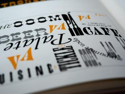
If you want to impact customers or potential segments or readers, or you want to create a logo, then you have to pay attention to the font that you are using. Here are the types of fonts and the messages they usually deliver psychologically:
Serif vs Sans-Serif Font
Usually the Serif fonts would be more readable and they are well defined via print. Books and articles would be having the serif font. Sans serif would be more readable when they are added to the screens and thus, they are more creative and need perfect lines to show them. Sans- serif would be delivering messages of innovation, creativity, informality, modernization and they can be used to address youth and young segments in the society. Serif fonts would be used to deliver messages of elegance and authenticity as well as of rationale. It also conveys originality and thus, the main target segment that would affect it the highest is the old and the adult segments.
Light vs Bold font
You want simplicity and elegance; light fonts always deliver these messages of beauty, simplicity and femininity. They can influence the female gender more. Bold fonts would be usually conveying power and they show more attention grabbing sentences as well as masculinity and dominance as well as control. Medium fonts can be the most readable fonts.

Rounded vs Angular font
If you are looking for fonts that convey softness, femininity and comfort, then rounded fonts that can do this effect. Angular fonts can be able to send feelings of formality, and durability. They can even be personalized as more muscular fonts.
Simple vs Complex Fonts
Straight forward messages are usually conveyed through simple fonts and if you want to have a unique message then you would be going with complexity.

Slanted vs Straight Font
Movement and action can be the impact of the slanted fonts. However, stability can be guided by straight fonts only.
Lowercase vs Uppercase Fonts
Innovation and compassion can be reached when you use lowercase fonts. If you want to deliver messages of power and strength, then uppercase fonts are the font of choice. If you would be using mixed case letters then they would be the most readable fonts with mixed feelings.
Separated Font vs Connected Font
When you use a separate font which is separated letters then they send feelings of individuality and fragmentation. If you would be using connected letters then it shall be conveying messages of unity and collectivism.
Condensed vs Extended Fonts
When the message that is required to be delivered would be required to reflect tightness and precision, then the condensed font is the best. The extended fonts would be conveying relaxation and spaciousness.
Short vs Tall Font
Short fonts would be usually sending feelings of stability and heaviness. The tall fonts would be conveying messages of aspiration and lightness.
Read also: The Best Google Fonts
If you are confused about the best font to use and you are looking for creative fonts, then check our online editor for the best fonts in design. Get started with Tasmimak!
Read Also
-
Essential Tips for Night Photography
-
Guide To Create Social Media Designs 2024
-
10 Famous Company Logos & Their Messages backing them up
-
404 Error Page Design Ideas
-
Application Letter Samples and Templates
-
Awesome Graphic Design Trends 2025
-
Benefits of Banner Advertising
-
Best Elegant Font fot your Design
-
Best Free Fonts
-
Best Free Fonts For Designers